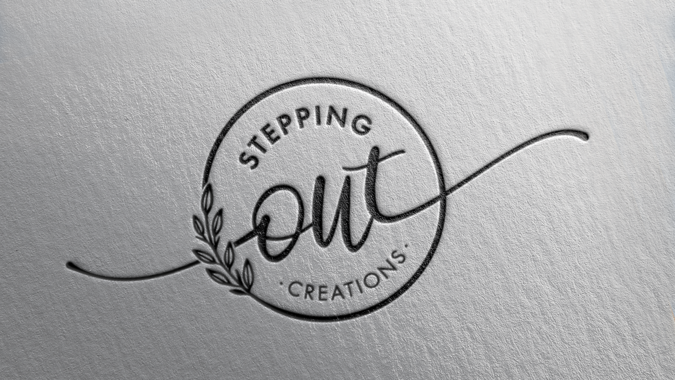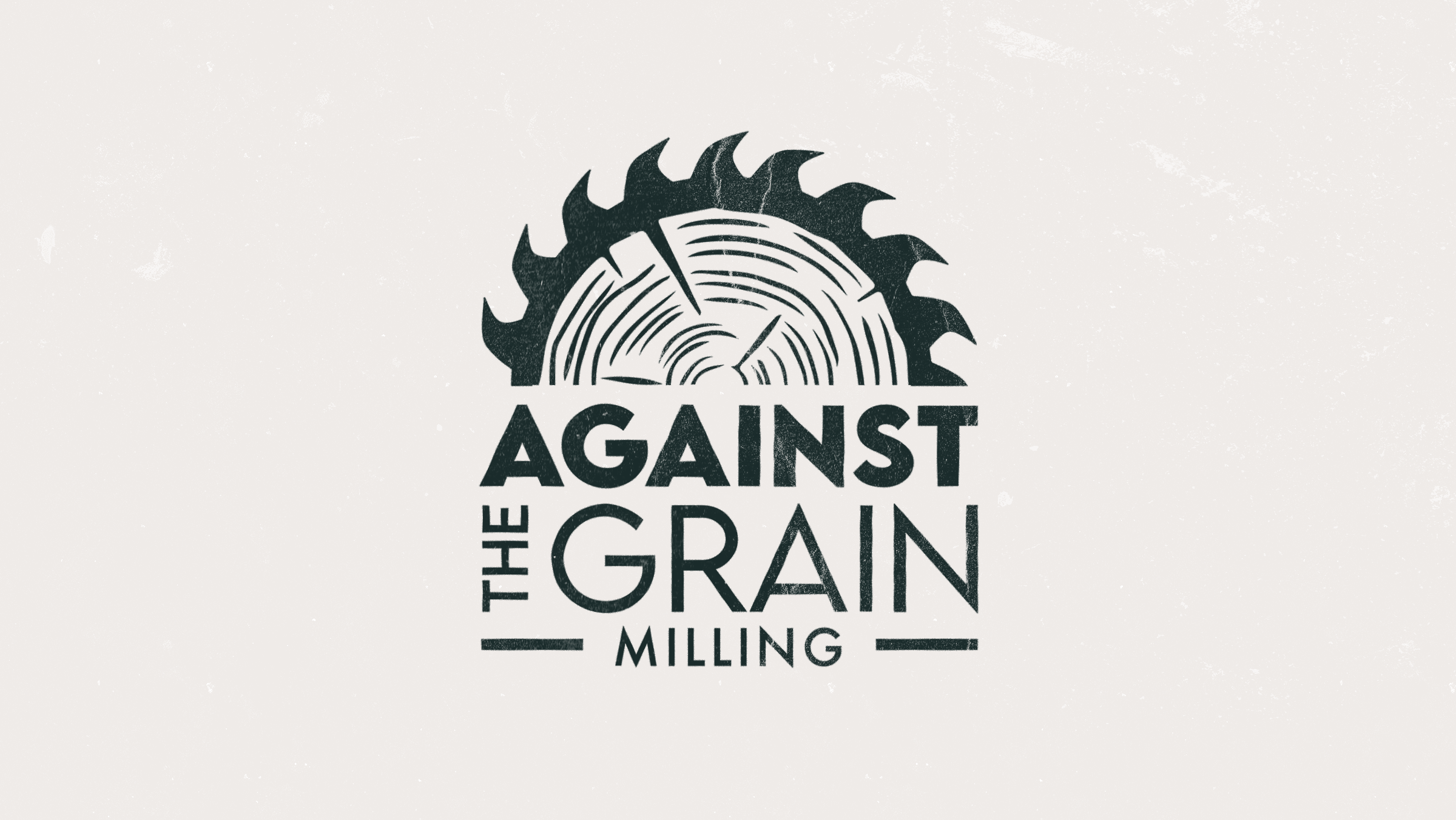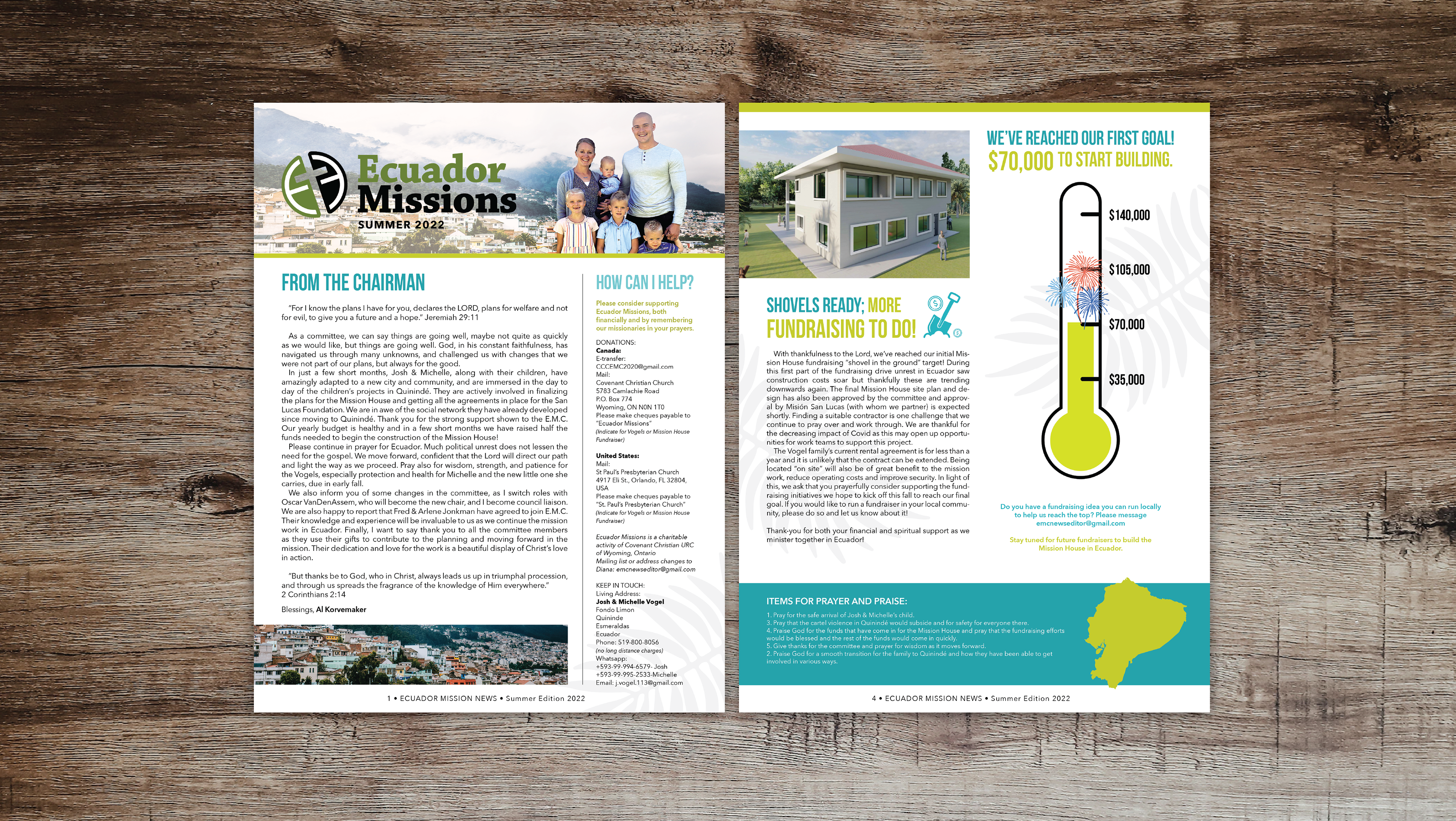
For this process, I started by researching similar businesses to this one and gained insight. Then I jumped right into roughs in illustrator, this was the easiest way to quickly get my ideas accurately on a page. The client fell in love with this logo because of the simple but bold design. The client decided on a darker green colour for the logo and I started to fine-tune the design.